Illustration and Visual Narrative - Task 2: Decisive Moment
Tow Wan Tian / 0343765
Illustration and Visual Narrative / Bachelor of Education / School of Education
Task 2: Decisive Moment
LECTURES
Week 5 / Composition Theory 2 - Foreground, Middle-ground and Background
For this week's lecture, we studied different types of planes of a scene which include:- Foreground - objects that are nearest to the viewers.
- Middle-ground - objects between the foreground and background.
- Background - objects that are furthest away from the viewers.
For this report, we had to capture any scenes of a video of our choice that portrays the use of foreground, middle-ground and background. Then, we need to outline the areas of the scene and explain what design principles were applied to each visual and how it affects the narrative.
Video Description
The chosen material is a music video for the song 'Eternally' by the South Korean boy band, Tomorrow x Together (also known as TXT). The music video is directed by Seong Wonmo, an art director and co-founder of the video production company Digipedi. It is part of the Star Seekers, a media franchise and shared fictional universe based on characters inspired by the group.
Background: Establishing the Setting

|
| Figure 1. The opening scene of the Eternally music video. (Timestamp: 1:57) |
In the opening scene, the five members stand on a podium in the middle of a ruined stadium. According to fan theories, it is generally assumed that a dragon appeared during the group's concert and caused destroyed the venue. The scene is supposed to depict the aftermath of the destruction. In the scene, the members are placed almost in the centre which naturally should be the centre of focus. However, their proportion is relatively tiny as compared to their surroundings. Therefore, the attention was not on the members and was shifted to the background and surroundings. I believe the contrast of proportion was to help viewers grasp the severity of the destruction that happened to the venue. The scene appears to be harmonious in terms of tones and shades. It is cast under a dark shade to bring out a sense of despair and misery.
Middle-ground: The Focus of Attention


|
| Figure 1.1 A scene where a member of the band, Soobin discovers a child running towards him. (Timestamp: 7:15) |
Foreground: A Brutal Discovery

|
| Figure 1.2 A scene where another member Yeonjun discovers his own death in the future. (Timestamp: 10:24) |
Continuing with the time travel plot, another member, Yeonjun has assumingly travelled to the future. In this particular scene, he found himself dead lying in the ruins of the stadium, the same venue in the opening scene. The dead body is placed in the foreground, directly in front of the viewers. Same as the member, the viewers are forced to face the hard brutal fact of death. I believe the intention of the placement of the body and the camera angle is to evoke shock and a sense of terror in a short amount of time.
Week 6 / Composition Theory 3 - Perspective
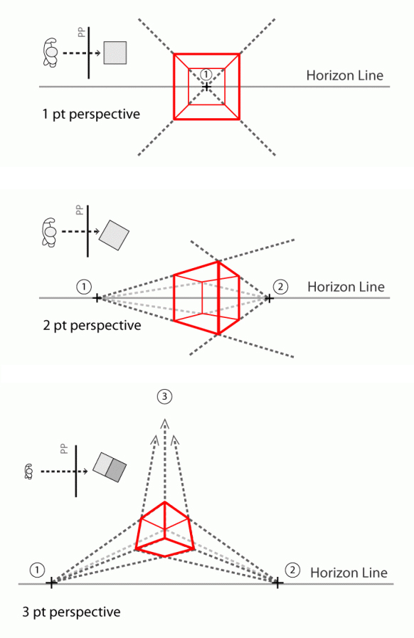
Three main perspectives:- One-point perspective
- Two-point perspective
- Three-point perspective

|
| Figure 1.3 The three different types of perspectives. |
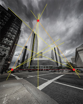
For this lecture report, we were required to find any form of visual media that expresses stories that capture the three different types of perspectives. Then, we need to draw lines to trace the perspective directions and note the vanishing points.

|
| Figure 1.6 Photo by Henry Desro on Unsplash (October 6, 2017) |
Week 7 / 3-Acts Structure
1. Storytelling BasisCentral theme - It is the main idea or underlying message. It includes the storyteller's personal opinion on the subject matter. A story may have both a major and minor theme.
Characters
Central Characters
Protagonist
Antagonist
2. Three-Act Structure
- Setup - The world in which the protagonist exists before the journey.
- Rising tension
- Conflict
- Resolution
- Prepare a short story for Task 3 - Graphic Novel.
- Employ the three-act structure in the short story
- Word limit: 300 words
PRACTICAL
Week 5 / Human Chiaroscuro

|
| Figure 1. Creating the shadows of the visual by tracing an image. Week 5 (29/4/2022). |

|
| Figure 1.1 Colouring the shadows, base and background. Week 5 (29/4/2022) |

|
| Figure 1.2 Adding texture to the shadow by using the clipping mask tool. Week 5 (29/4/2022). |

|
| Figure 1.3 Creating several variations of visuals using different techniques and textures. Week 5 (29/4/2022). |

|
| Figure 1.4 Final visuals for the practice. Week 5 (29/4/2022). |
Week 6 / Colour Basics
For this week, we learned various techniques on how to fill in the colours of an illustration. For this particular practice, we used a template from Freepik (Figure 1.5). By the end of the practical, our goal was to learn how to use the following tools and techniques:- Line tool
- Pen tool
- Effect - distort\zig zag
- Warp tool
- Outline stroke
- Expand
- Expand appearances
- Pathfinder merge
- Isolation mode
- Blob tool
- Draw behind
- Draw inside

|
| Figure 1.5 Opening AI template in Adobe Illustrator and copying the whole image into a new layer. Week 6 (6/5/2022). |
Before jumping into the colouring practice, Mr Hafiz explained the differences between a path, stroke and fill and how they affect the visuals. He also demonstrated how to apply effects such as zig-zag and distort to the lines.
 
|
| Figure 1.1 My attempt to add effects to the lines and use the pathfinder tool. Week 6 (6/5/2022) |

|
| Figure 1.2 My chosen colour palette from Adobe Color. |
Next, Mr Hafiz introduced us to the first technique of colouring using the merge option of the pathfinder tool. First, we need to draw a shape of the colour of our choice and layer the shape directly behind the visual that we want to colour (i.e. the flower). While selecting both the shape and the flower, open up the pathfinder tool and select 'merge'. Next, ungroup the visual and remove the excess colour (Figure 1.3).

|
| Figure 1.3 Coloring the flower using the pathfinder merge option. Week 6 (6/5/2022) |
 
|
| Figure 1.4 Colouring the hands using the shape builder tool, the live paint bucket and the blob brush tool. Week 6 (6/5/2022) |

|
| Figure 1.5 Final outcome for the practice of colour basics. Week 6 (6/5/2022) |
INSTRUCTIONS
Task 2: Decisive Moment
Figure 1. The official music video for Nap of A Star by TXT (2019).
A Summary of the Music Video
The Decisive Moment

|
| Figure 1.2 The scene where the cat first appears in the MV. |
Visual Research
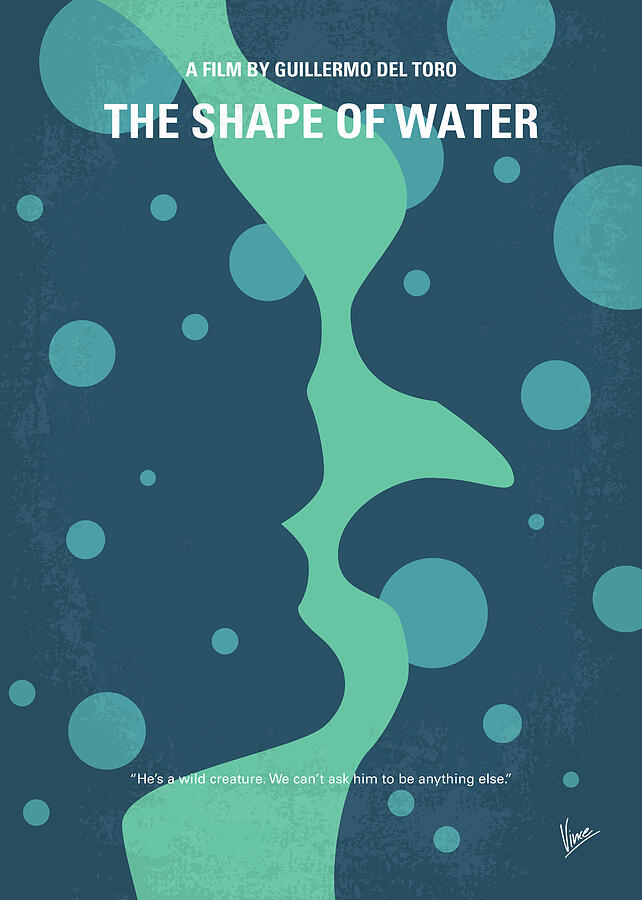
Coming back to the design of the poster, I first needed to understand what is a minimalist poster and what elements should I include. Hence, I turned to Pinterest to look for some inspiration. Based on my findings, I found out that many minimalist posters apply the Gestalt theory of figure-ground and closure in designing the visuals. It is a good way for combining two to three important visual elements of the narrative into one complete visual. Below are some of my favourites.

|
| Figure 1.3 Green Book poster art by Ricor Jr. on PosterSpy. (2019). |

|
| Figure 1.4 'No 902 My The Shape of Water minimal movie poster' by Chungkong Art. |

|
| Figure 1.5 Screen capture of the examples of minimalist posters compiled on Pinterest. Week 6 (12/5/2022). |
Sketches

|
| Figure 1.6 Sketch #1 and #2 include the cat and the boy as the main visual elements. Week 6 (12/5/2022). |

|
| Figure 1.7 Sketch #3 and #4 include the boy, the star, tree branches and the cat's eyes as visual elements. Week 6 (12/5/2022). |
Based on Ms Anis's feedback on the sketches, I decided to go with Sketch #2 and began the digitalisation. Using the original screen capture of the scene as the template, I created the outlines by drawing multiple strokes using the Brush tool in Adobe Illustrator. Then, I filled in the illustration using colours picked from the screen capture.

|
| Figure 1.8 Outlining and colouring the illustration with the screen capture as reference. Week 6 (14/5/2022). |
At this point of the digitalisation, the background of the poster seemed empty, so I decided to incorporate the visuals of tree branches in the background/foreground and place them around the main visuals. Using the screen captures as references, I traced out several designs of branches.

|
| Figure 1.9 Tracing the branches. Week 6 (14/5/2022). |

|
| Figure 2. Placing the branches around the design. Week 8 (19/5/2022). |

|
| Figure 2.2 Adding a line of Korean and English lyrics from the song 'Crown' Week 8 (20/5/2022). |
As mentioned previously, the music video's story is based on the narratives of a different TXT song, titled 'Crown'. The lyrics of Crown actually reflect the visual narrative of my poster better, so I used the lyrics from that song instead of Nap of A Star.
The line I used was 'Save me, maybe I have turned into a monster.' The line reflects that the boy (referring to the band member who sings this line) thinks he is bad and evil due to his adolescent problems and he is reaching out for help due to his suffering. I think the message of this line reflects in the design well enough as it echoes with the visual of the boy with horns (monster) and the ambiguity of the cat's intention (since the protagonist of the MV is still not completely sure whether the cat is there to save him, so he called out for help anyway).
Links to the Korean lyrics and English translation of Nap of A Star

|
| Figure 2.3 Adding gradient in the background to further emphasise the main visual elements. Week 8 (21/5/202). |
I forwarded Attempt #2 to Ms Anis for some feedback.

|
| Figure 2.6 Attempt #3 based on Week 8's feedback. Week 8 (21/5/2022). |

|
| Figure 2.7 Final attempt. Week 8 (22/5/2022). |
I went with a vector style for a cleaner look and applied a subtle gradient to the outline. Based on the feedback received, I added a muted white highlight to the boy. After a few more minor changes, I was quite satisfied with the outcome so I chose this final design to develop it into a GIF.
Animating the GIF
Before creating the animation, I sketched out some simple frames to help me better visualise the flow of the animation. The GIF would start with the cat's eyes closed and then open, followed by a flash of light and then the branches started growing out from the side.

|
| Figure 2.8 Sketches of the frames for the animation. Week 8 (22/5/2022). |
.jpg)
|
| Figure 2.9 Creating individual frames for the GIF in Adobe Illustrator. Week 8 (22/5/2022). |
Once I have completed the frames, I imported them into Adobe Photoshop to develop the GIF. After a few attempts, I decided to exclude the flash because I felt that it disrupted the flow of the animation.

|
| Figure 3. Attempt on animating the poster. Week 8 (22/5/2022). |
Final Submission for Task 2 - Decisive Moment
 |
| Figure 3.1 Final Submission for Task 2 - Decisive Moment (JPEG). Week 9 (28/5/2022). |
 |
| Figure 3.2 Final Submission for Task 2 - Decisive Moment (GIF). Week 9 (28/5/2022). |
FEEDBACK
Week 7
General Feedback: -Specific Feedback: The composition for Sketch #2 (Figure 1.6) is better and I like how you included the broken horns of the boy.
Week 8
General Feedback: -Specific Feedback:
- Figure 2.5 - Ms Anis suggested for a clean vector style for the whole design. She also suggested using a muted white for the outlines and mimicking the outline of the cat silhouette in the original screen capture. She also suggested applying a gradient to replicate the shiny effect of the cat's eyes.
- Figure 2.6 - Ms Anis commented that the improvement on Attempt #2 was much better and she further suggested adding white highlights on the boy to give more contrast.
REFLECTION
For this task, I applied the new gradient technique learned from Mr Hafiz's practical session and I was very satisfied with its results. By applying just a small visual effect, it can immediately add depth and dimension to the design. While working on the task, I talked to a few of my classmates and they have given me some valuable and useful feedback to help me improve on my design. I really enjoy the process of sharing ideas and commenting on each other works as I gain a lot of insights from it.
I found myself getting better at using Adobe Illustrator, especially when using the Pen tool, Pathfinder and Gradient tool. The Pen tool was once my biggest enemy of the software and I have dreaded its use for a long time. However, now that I got to use it more in my work, the tool has become increasingly convenient to use.
Findings


Comments
Post a Comment