Illustration and Visual Narrative - Task 1: Exercises
01.04.2022 - 22.04.2022 / Week 1 - Week 4
Tow Wan Tian / 0343765
Illustration
and Visual Narrative / Bachelor of Education / School of Education
Task
1: Exercises
LECTURES
Week 1
Having received a warm greeting from the module facilitators, Ms Anis and Mr Hafiz, they briefed us about the module and assignments. After the briefing, Mr Hafiz gave us some time to attempt the Beizer Game, a game for practising the Pen tool. I remembered playing this in a previous module and struggled a lot. Now having much experience with the Pen tool, the game is easy-peasy. Then, the facilitators gave us an introduction to the first exercise, known as the Vormator Challenge. They also advised us to do some research on the topic to help us get prepare for the task.Week 2 / Character Design Basics
Before jumping into sketching the characters, I watched the pre-recorded lecture video on Character Design Basics to have a better understanding of how to create interesting and appealing characters.
For the Vormator Challenge, we should keep in mind to create characters with the approach of stylised design. Stylised design means that the design has abstract and simple elements that somewhat resemble the original design. An example that I could think of is the characters (the crewmates) from the online game Among Us. A realistic design of the crewmates who are supposed to be astronauts can be complicated (i.e. space suit and space gear), yet the design is stylised and oversimplified into a beany aesthetic while keeping recognisable elements of an astronaut.

|
| Figure 1. Various designs of the Among Us game characters. |
3 Principle of Stylised Designs
- Iconic - Characters are easily recognisable even in black silhouette.
- Simplified - Easy for viewers to digest and understand the purpose of the character
-
Unique - Characters are memorable and stand out to the viewers.

|
| Figure 1.1 A screenshot of one of the lecture slides on the three principles of stylised design. |
Principles of Character Design
- Shapes - Consider the dominant shape of the character. Be creative and explore the possibilities of combining different shapes to create your character. Use the characters' persona and background as the basis of the shape of the design.
- Colours - Colours are important in establishing and differentiating the roles of the characters. Certain colours come with certain psychological and emotional connotations, allowing the viewers to relate to the personality and narrative of the characters.
- Emphasis & Contrast - Exaggerate the emphasis and contrasting visual elements to make the design stand out by using shapes and colours.
- Harmony - Every element in the design should complement each other (e.g shapes, colours, lines, motifs, patterns, etc.). Consider the visual hierarchy. Usually, the elements that stand out and are exaggerated reflect the personality and narrative of the character.
- Expressions & Poses - Clear visualisation of the characters' behaviours, quirks and personalities makes it easier to appeal to the viewers.
|
|
| Figure 1.2 An image of Eeyore from the animated film The Many Adventures of Winnie the Pooh (1977). |
Eeyore is an old grey stuffed donkey that appears in the animated franchise Winnie the Pooh. He has a detachable tail that is pinned down with a nail and accessorised with a pink bow. Despite being nailed to his bottom, Eeyore's tail often go missing. It is almost always Christopher Robbin who helps reattach his tail. He is friends with Winnie the Pooh, Piglet, Tigger and Rabbit. As a fellow resident of the Hundred Acre Woods, he has his own area known as "Eeyore's Gloomy Place".
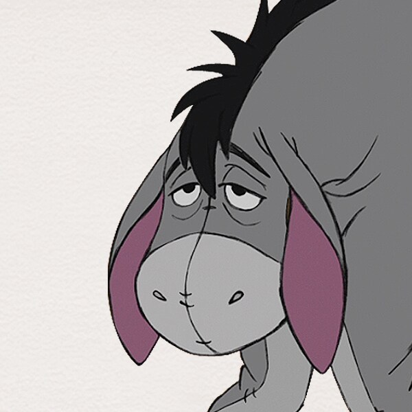
Eeyore is best known for his pessimistic and depressed characteristics. He complains a lot and always groans about the worst thing that could happen in the future. Hence, having grey as his coat is a great choice to portray his gloomy nature. In the animation, Eeyore's head and ears are always seen hanging low, with his eyebrows frowning and eyes being half-open and half-closed. We rarely ever get to see him smile and be happy. Every facial feature of his goes downwards, visually supporting his everyday mood of being down and unenergetic.

|
| Figure 1.3 A close of Eeyore's gloomy expression. |
We can identify a few horizontal short strokes on his face and limps. This visual feature of his suggests sewing stitches on a stuffed toy which describes Eeyore's character as a stuffed donkey.
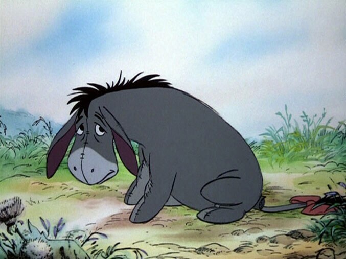
Whenever Eeyore sits down, the visual weight goes to the bottom part of his body. His back is arched and hardly up straight. It almost gives off the impression of a grumpy old man who slumps into his seat and is too exhausted to ever get up again. Again his poses in the animation are in line with his nature of being gloomy and low on energy.

|
| Figure 1.4 Eeyore sitting on the ground. |
Week 3 / Chiaroscuro
Chiaroscuro

|
| Figure 1.5 The movie poster of the Korean film 'New World' (2013). |

|
| Figure 1.6 A scene from the film 'New World' where the main protagonist Lee Ja-sung had to shoot his handler in order to save her from worse humiliation. |
The main protagonist, Lee Ja-sung is an undercover police officer who works in Goldmoon International, a corporate crime syndicate in South Korea. Halfway through the film, Ja-sung's leader and 'close friend', Jung Chung called Ja-sung and ordered him to meet him in a warehouse. Upon arrival, Jung asked Ja-sung to open a barrel and to his surprise, Ja-sung found the handler of his undercover mission, all bloody and heavily wounded. Jung explained that he found out there are spies in the corporate and the handler is one of them who leaked confidential information to the police. He handed Ja-sung the mission file with detailed information about the personnel involved. As he flips through the file, he is surprised to find his information missing. He is confused about whether Jung knows about this true identity. Jung ordered the hitman group who accompanied him to finish off the handler. This leaves Ja-sung with no choice but to shoot his handler himself in order to save her from worse humiliation (Figure 1.6).
Week 4 / Composition Theory 1 - Visual Shots and Compositions
- Visual Narrative - The visuals in the scene complement the overall narrative.
- Visual Flow - The scene has a clear flow that directs the viewers' eyes.
- Visual Balance - The visuals are arranged to balance the composition.
- Visual Hierarchy - The visuals are arranged in a way that directs the viewers' eye to certain details first.

|
| Figure 1.7 Photograph taken outside the campus library. Week 5 (26/4/2022). |

|
| Figure 1.8 A photograph of my mother's indoor plants. Week 5 (29/4/2022). |
 |
| Figure 1.9 A photo taken during a visit to REXKL. Week 5 (29/4/2022) |

|
| Figure 2. A photograph of my friend at a private beach in Cherating. Week 5 (29/4/2022). |

|
| Figure 2.1 A photograph of a Totoro stuff toy placed in a plant. Week 5 (29/4/2022). |

|
| Figure 2.2 A photograph of my friend and I. Week 5 (29/4/2022). |
INSTRUCTIONS
Task 1: Exercise 1 - Vormator Challenge
For this challenge, each student was given a fixed set of shapes (Figure 1.) to create a unique character. It was also suggested that we create a name and lore for the character.
We are allowed to rotate, flip, duplicate and scale the shapes proportionally. No skewing, free-transforming and/or any sort of altering the original shapes.

|
| Figure 1. The eight shapes of the Vormator Challenge. |
Visual Research
A while ago, I watched a YouTuber playing a Chinese mobile game called 'Paper Bride 2'. It is a Chinese horror mystery puzzle game that incorporates a lot of Chinese customs and superstitions as the mechanics of its puzzle. One of the puzzles uses various face masks of the Sichuan Opera Face-Changing art. The face masks left a strong impression on me due to the jumpscare upon solving the puzzle. I think the face masks would be a great design inspiration for the task so I did more research on the dramatic art form.

|
| Figure 1.1 A screenshot of the face masks puzzle from the mobile game 'Paper Bride 2'. |
The art form is better known as '变脸' (Biàn Liǎn) in Mandarin. It is part of the ancient Chinese performing art of the Sichuan Opera. The performers will wear vibrantly coloured face masks, painted with distinct and highly expressive facial expressions, which they will change one by one with a swipe of a fan or a movement of a hand. The art of face-changing is widely used to express different emotions and feelings of the character in a visually dramatic way.
Each mask depicts a well-known character in Chinese history and literature. They come in various colours such as red, yellow, white, green, black, blue, etc. Each colour represents a type of character. For example, red is usually for courageous war generals.

|
| Figure 1.2 A photograph of the Sichuan opera's face-changing performance. |
After studying a few images of the poses and movements of the performance, I sketched out a few simple outlines of a face-changing performer (Figure 1.3). However, after doing so, I did not feel like continuing with the idea so I abandoned it.

|
| Figure 1.3 Sketches of a face-changing performer with various poses. Week 2 (9/4/2022). |
Inspiration / Rafflesia
After experiencing a creative block for a few days, I decided to restart this task with a different approach. I started by drafting a back story for the character and then sketching out a rough image of it.
During my practicum in a primary school, the students are tasked to write a
legend based on a given object; rafflesia was one of the options. Though my
main job was to facilitate the writing lesson, I also tried to write a
legend for the plant myself. I thought that the story can work well as a
foundation for this particular exercise.
The character was a princess who lived in a magical land. Despite being bestowed magical powers to better look after her subjects, she was notorious for abusing her powers to cause misery upon her kingdom. The folks had enough of her rule and plotted an assassination. She was poisoned to death and her body was left to rot deep inside a mystical rainforest. Coincidentally, near where the princess was left had a giant rafflesia. The flower absorbed her magical powers and parts of her will and transformed into a monster now known as 'Afleria'. The monster will let out a deadly smell to lure her prey and devour them within a blink of an eye.
Sketches
 |
| Figure 1.4 Various sketches for the character Afleria. Week 3 (14/4/2022). |
 | |||
| Figure 1.5 Vileplume from the Pokemon franchise. |
 |
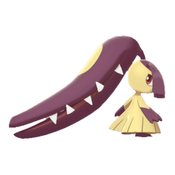
| Figure 1.6 Mawile from the Pokemon franchise. |
 |
| Figure 1.7 The final sketch for the character Afleria. Week 3 (15/4/2022). |
For my character, I wanted the main focus to be the flower that is part of her head, so I prioritised the floral part by giving more textures and details. Due to the nature of the pose, the face is mostly covered by the flower. I had little space to work with so I focused on designing the eye shape to bring out the attitude of the character. I gave the character triangular eyes to make it seem like she is looking back and glaring at something/someone. I kept the body relatively simple and gave it a snake/slug-like body shape with a few patches (a reference to the pattern that can be found on the bud of a rafflesia).
Digitalisation
 |
| Figure 1.8 Placing the Vormator shapes to form the basic outline of the character. Week 4 (18/4/2022). |
 |
| Figure 1.9 Complete outline of the character. Week 4 (18/4/2022). |
Colour Fill
After completing the outline of the character, I look up colour palettes on Adobe Color to help me build the colour of the character. As a result, I narrowed it down to three palettes and I would only use one as the main palette and the other two as backups.
 |
| Figure 2. Looking for colour palettes on Adobe Color. |
 |
| Figure 2.1 Filling in the colour of the character with the chosen colour palettes at the side. Week 4 (20/4/2022). |
I ended up with three colour variations of the character design (Figure 2.2). Based on the feedback from Ms Anis, I chose #2 as the final design of my character.
 |
| Figure 2.2 Three colour variations of the character design. Week 4 (23/4/2022). |
Final Submission for Task 1: Exercise 1 - Vormator Challenge

|
| Figure 2.3 Final submission for Task 1: Exercise 1 - Vormator Challenge (JPEG). Week 5 (29/2/2022). |
Task 1: Exercise 2 - Vector Illustration
After finalising the character design for the Vormator challenge, I moved on to the next exercise which was to design a game card using the same character.Visual Research
Game Card
 |
| Figure 2.5 A screen capture of game card reference compiled on Pinterest. Week 5 (25/4/2022). |
- An illustration of the game character (horizontal or vertical)
- The name of the character
- A short description of the background of the character
- The character stats
- Abilities/powers (attacks and defences)
- Rarity
 |
| Figure 2.6 Gamecards from the game 'Lord of Scotland' by Kalinda Patton. Retrieved from Board Game Geek. |
 |
| Figure 2.7 Gamecards from the game 'Control' designed by C Hanson. Retrieved from Board Game Geek. |
I envision the character to be lurking in a rainforest, thus I would create a rainforest vector as the background of the card. Again, I went on Pinterest and compile a few images as references.
 |
| Figure 2.8 A screen capture of image references compiled on Pinterest. Week 5 (25/4/2022). |
Sketches
 |
| Figure 2.9 Two sketches for different layouts of the game card. Week 5 (25/4/2022). |
The first sketch follows a rather traditional design of a game card with the character illustration covering 2/3 of the card and a description box at the bottom. As for the second design, I created a 'frame within a frame' composition by drawing a tree trunk on the left in the foreground and placing the character on the right in the midground. The tree trunk can be utilised as a column to place the description. I could not decide on one design so I digitalised both and compared them later.
Digitalisation
 |
| Figure 3. Drawing individual leaves for the game card. Week 5 (27/4/2022). |
 |
| Figure 3.1 Arranging the individual vectors into a landscape. Week 5 (27/4/2022). |
 |
| Figure 3.2 Creating two designs for the game card. Week 5 (28/4/2022). |
Final Submission for Task 1: Exercise 2 - Vector Illustration

|
| Final Submission for Task 1: Exercise 2 - Vector Illustration (JPEG). Week 5 (30/4/2022). |
- AFLERIA - the name of the Vormator character
- B - refers to the overall rank of the character (other ranks include SS, S, A and C)
- Uncommon - refers to the rarity of the card (other rarity includes common, rare, super rare)
- The skeleton icon - indicates that the character uses a poison attack (odour) and can cause 12 damage
- The leaf icon - indicates that the character uses a leaf attack and can cause 9 damage.
FEEDBACK
Week 4 / Vormator Challenge
Ms Anis: (Figure 2.2) There is more colour balance for #2 and the colours complement each other better. As for #3, the red seems to be fighting for attention with the green. For #1, the red is almost like a purple colour and purple is a colour that does not work well with green.REFLECTION
ExperienceOverall I had an enjoyable experience while completing the task. I like the creative challenge of creating my own character using a set of shapes and I was quite satisfied with the final outcome of my character and game card. Although I self-taught myself how to use Adobe Illustrator, I took the opportunity to refresh my skills and relearn some new techniques from the facilitators.
Observation
I observed a change in my art style. I used to layer multiple shades of colours to build depth for an illustration. However, for this task, I discovered the use of gradient to create dimension and the results were better than my old approach. Not to mention that it was more convenient and timing saving. I will continue to experiment more with the use of gradients for future projects.
Findings
The Vormator challenge was a good task for me to practise with shape building using limited materials on hand. Before starting the task, I thought I would face confinements in my character design due to the limited shapes I could use. However, once I change my original view on the task, I found that the limitations led to more exploration and experimentation with my design. The shapes did not affect my design, the only challenge was for me to optimise the appropriate shapes and techniques to help build the overall silhouette of the character. Game card design is an entirely new genre for me and I learned a lot about the different types of game card compositions. I viewed game cards as a form of information medium, so I brought in some of the knowledge acquired from Information Design to help me organise the information about the character.

Comments
Post a Comment