Design Principle - Final Project & Final Reflection
Tow Wan Tian / 0343765
W10 / 01.06.2021
Lecture 8 - Visual Analysis
Finally, we've reached the final project for the Design Principle, time sure flies. Before working on the final project, we were instructed to watch the last recorded lecture where we learned about visual analysis.
Visual Analysis is the method of understanding design that focuses on the visual elements and principles. It is a description and explanation of visual structure for its own sake. Doing visual analysis also recognises the choices that a designer made in creating the design and better understand how the formal properties of a design communicate ideas, content, or meaning. Visual analysis is a critical part of visual literacy, a skill that helps people read and critically interpret images in various settings, may it be in a museum, on social media, in entertainment, advertising, etc. Visual analysis is an important trait and knowledge for designers as it helps them to analyse and understand the message that is carved in a design. Practising visual analysis sharpens critical judgement skills and helps people seek out answers.
3 Phases of Visual Analysis
- Phase 1 - Observation (Design Elements)
- Look closely at and identify the visual elements of a design, describe them carefully and accurately in own your words. Do not read beforehand about the design at all. Look at the design on a surface level. Write what you see. This phase is about looking, thinking, and finding good language to communicate what you notice.
- Phase 2 - Analysis (Design Principles)
- Think about your observations and try to make statements about the work based on the evidence of the observations. Think about how the specific visual elements combine together to create a whole, what effect the whole has on the viewers, and how the eyes are led through the work (the flow of the design).
- Phase 3 - Interpretation (Facts, Meanings and Messages)
- The observations, descriptions and analysis of the design are fused with facts about the design (e.g. designer's background, historical context, etc.). Think about the meaning and the the purpose for it to be created.
Final Project - Visual Analysis & Final Blog (40%)
Part 1 - Visual Analysis
- Select a design of your choice (e.g. poster, billboard, illustration, etc. )
- Conduct a visual analysis of the design in about 500 words.
Part 2 - Design
- Produce a work of design in A4 or A3 size, inspired or influenced by the design you have analysed, or as a reaction to it.
- Write a 150-200 word rationale for your design.
Guided questions for Final Reflection
- What have I learned in this module?
- What do I enjoy the most?
- What do I not enjoy the most?
- What have I learned about myself through this module?
- What has changed and what has not in my learning journey?
- What could be improved in this module?
Timeline
Visual Analysis
Exploration
First thing first, what design should I choose to conduct a visual design? The choices are basically endless - graphic designs, photography, illustrations, book covers, music albums, websites, posters, etc. I have narrowed down two routes for me to start this research: one, I could start from something close to my heart, something I like and is familiar with, or two, I could explore and discover new work of designs produced by artists and designers I have yet to know.
After reading the instructions and requirements of the visual analysis, I was immediately reminded of the design-related YouTube videos that I've watched in the past. There is a video which talks about movie posters of East Asia (China, Japan and Korea); it's interesting to watch the creator of the video praise well-designed posters and rant on bad posters. I also happened to watch a TED talk video which is about book cover designs years ago, ever since then I found myself having more interest in book covers. Therefore, I was quite tempted to choose movie posters or book covers as the subject of my visual analysis.
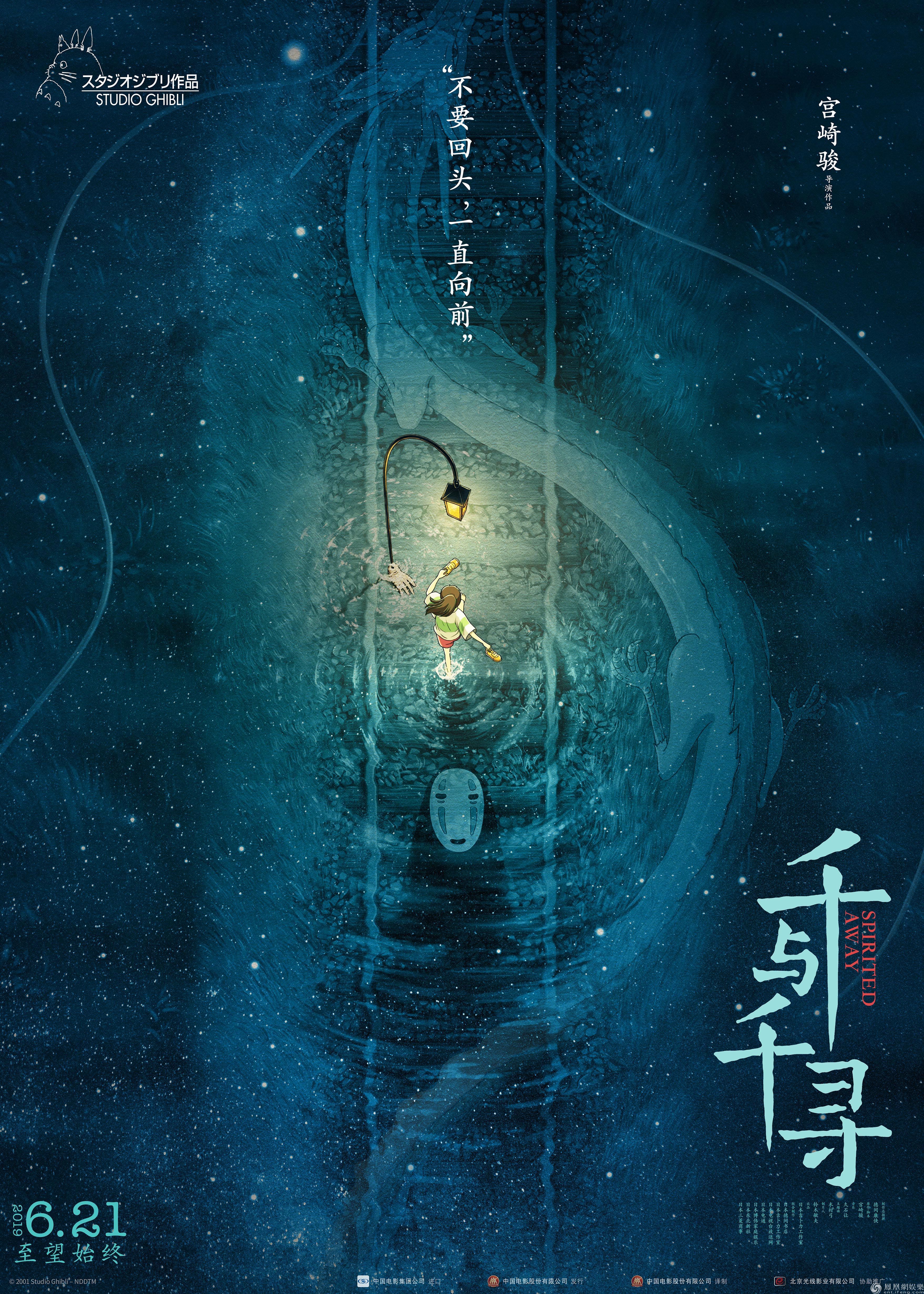
Both videos showcase some really interesting designs and a good design can intrigue its viewers to learn more about the movie or book it represents. In the first video, the designer that stood out to me was the Chinese poster designer Huang Hai (黄海). I turned to the Internet to lookup more information about him and his work.
The designer was born in the Fujian Province, China and graduated from the Art College of Xiamen University. He worked as a social journalist in a TV station for about three years and he got enrolled in a training programme in Beijing run by the British advertising company, Ogilvy. After the programme, he went to work as an art director at a domestic Chinese company. He began to gain attention as a poster designer after working on the posters for the Chinese film The Sun Also Rises directed by Chinese director Jiang Wen. After the success of the first poster, he began to work on more movie posters and almost all of his works are well received.
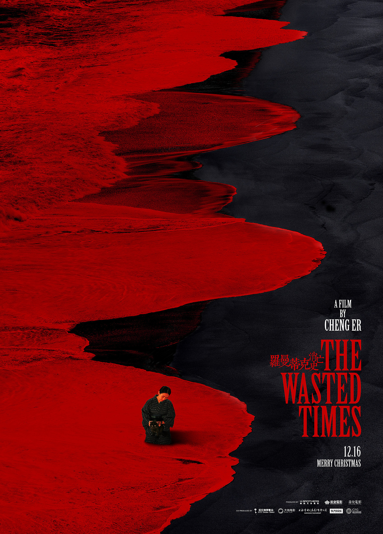
Here are some of his works:


Selected Design
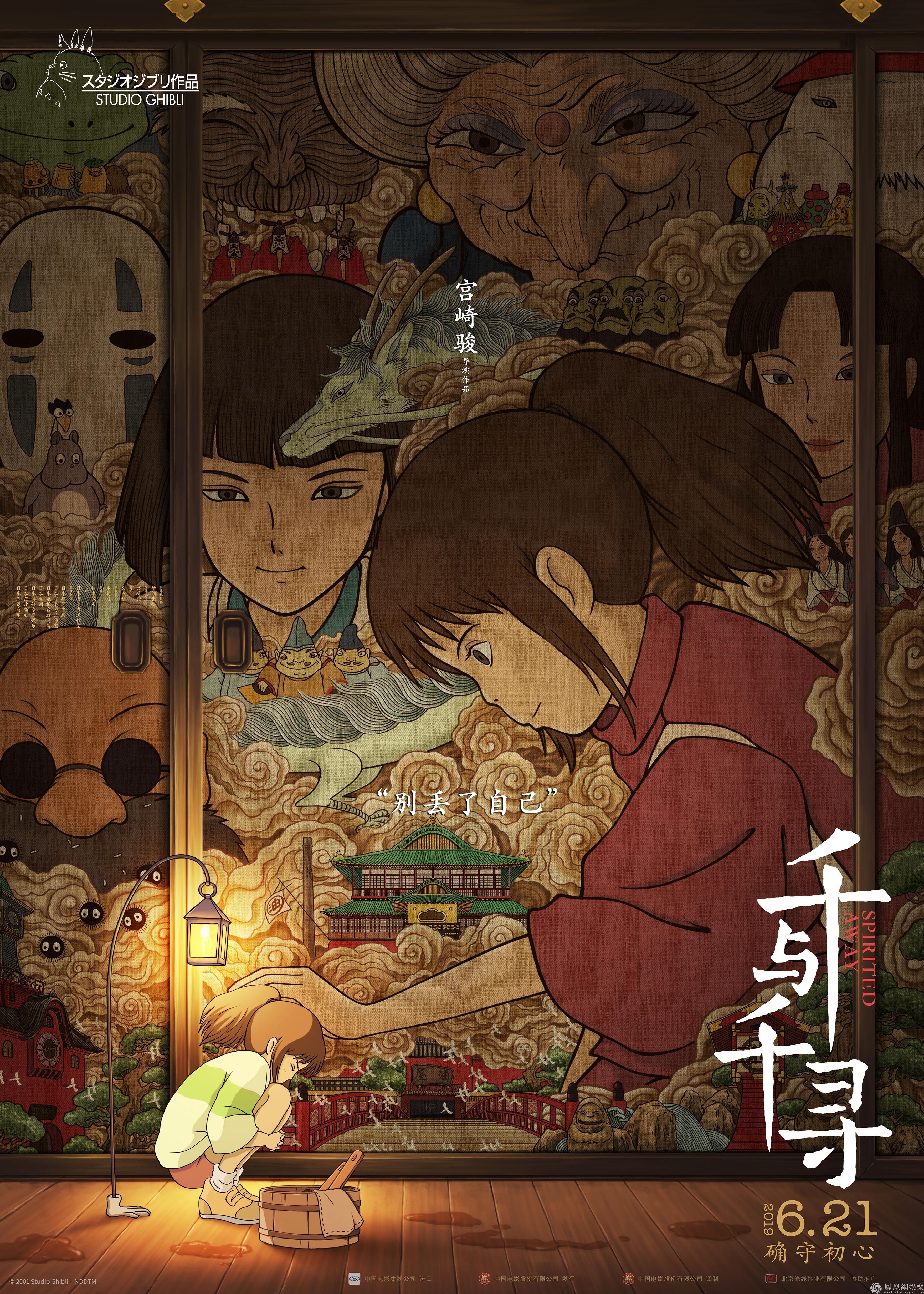
Phase 1 - Observation
The poster is created in a vertical orientation. The main colours observed are warm colours such as red, yellow, orange and warm brown. There are a lot of organic shapes as the main objects are human figures/human-like figures. A small human figure can be seen in the foreground. In the background, several human faces can be observed printed as the decoration of the sliding door, and the faces can be seen looking at the girl in the foreground. The foreground and background were divided by a horizontal line. White Chinese characters can be observed in the bottom right of the composition, aligned vertically from top to bottom. Below the white text is a piece of yellow text, aligned horizontally. Two small white quotations can be seen in the middle of the composition, one is aligned vertically on the upper middle, while the other one is layout horizontally at the dead centre. Another small white piece of text and vector can be seen in the top left corner of the design. A thick brown converging line can be seen on the left of the composition, reaching from the top and ending at the horizontal line.
Phase 2 - Analysis
Phase 3 - Interpretation
Reference
Visual Research


Idea Exploration
Book Cover Design
Synopsis of the Short Story
An odd sound from the old VHS player broke the silence of the night. It brought back Yee's memories of the last Chinese New Year when she got to encounter a special guest from faraway China.
Yee, the main protagonist, is a 16-year-old high-schooler. One night, as she was getting ready for bed, she heard an odd sound coming from the old VHS player. The player was unplugged and certainly, it should not be operating. This unsettling incident led her to the flashback of her encounter with Uncle He, a special guest from China during the last Chinese New Year. Yee had a chance to talk to her distant uncle and he left a strong impression on her. However, she was not granted a second chance because Uncle He passed away the same day they met.
W12 / 15.06.2021
Sketch 1 shows two dark silhouettes sitting on a VHS tape, labelled as 'His Last Wish'. The silhouettes represent the two main characters of the story, Yee and Uncle He. Both figures are arranged to show that they are sitting next to each other and having a conversation, in reference to an important scene of the story. The VHS tape plays a significant role in the story because it is directly related to Uncle He's last wish and symbolises his regret. Therefore, the VHS tape is incorporated as one of the components of the design. The text 'His Last Wish' is the title of the short story and it is placed as a label on the VHS tape, tying the object and its referent together. A quote from the story is placed at the top right of the composition to offset the 'heaviness' of the lower part of the design.
Sketch 2 shows a hand holding a VHS tape-like baggage with a dark human silhouette sitting on it. Based on the same context, the VHS tape was once again incorporated as an important component of the story and design. It was designed to resemble a piece of baggage and the baggage was incorporated to imply Uncle He as the guest from far away. Hence, the hand shown in the design would certainly be Uncle He's hand. Following the previous context, the human figure is the main character, Yee. Another thing to point out is that a nearly flatlined electrocardiogram is labelled on the VHS tape, indicating Uncle He's passing in the story.
W13 / 22.06.2021
- VHS tapes/cassettes that are stacked on top of another. VHS players would also be an interesting visual.
- Stock photos of an old Asian male and a teenage Asian female to represent the two characters. Preferably in sitting positions.
- Red as the background - The story touches on themes such as Chinese traditions, family ties and relationships. The colour is deeply rooted in Chinese culture and is often associated with the community as well. Therefore, I believed it is appropriate to use red as a reference to the story's theme and Chinese culture in general.
- White text to contrast the relatively dark background. Although the story is written in English, I would incorporate Chinese characters as the title as well in order to be persistent with the approach of representing Chinese culture.
- Light source - At this point of the project, the designs I came up with didn't quite reflect the selected design well enough. Thus, I decided to follow Huang's approach in the Spirited Away poster by adding a light source to my design. However, I wasn't sure how to create this effect.
Later on, I began searching for materials on the internet and compiled the potential materials into a Pinterest board. Next, I moved on to filter out some of the materials and began creating several variants of the design. Let's skip the tedious step-by-step explanations of the whole making process (it would take forever) and allow me to present the different various variants that I have created:
W11 / 08.06.2021
Feedback on Phase 1 and 2
- Dr Jinchi commented that Phase 1 is good and does not require corrections.
- In Phase 2, she suggested adding 'seems to' or 'gives the impression of' in the sentence 'Additionally, the girl in red...the smaller girl's head'.
- Then, she suggested changing 'Chinese font' to 'Chinese characters'.
W12 / 15.06.2021
Feedback on Phase 3
- Dr Jinchi suggested tying this part 'According to Global Times ... comforting her' back to the intention of the title.
- She commented that there is factual information on the poster, research findings, as well as a personal interpretation of the design.
W13 / 22.06.2021
Feedback on Sketch 1 and 2
- Dr Jinchi recapped my approach of redesigning the poster.
- Referring to Figure 3, she suggested that I should compose the VHS tape at a different angle, allowing the tape to be more recognisable.
- She sees the potential of placing the quote on the top right of the composition to offset the chunk at the bottom. It would look more balanced.
- She mentioned that it is not necessary to draw. I can source photos and images online.
- After reviewing both sketches, she recognised the VHS tape as an important component of the design. Therefore, she suggested that I try various tape angles and choose one that shows the most dynamic.
W14 / 29.06.2021
Feedback on the several attempts
- Referring to Figure 4, Dr Jinchi said that I should try different fonts for the title so that it stands out more.
- After looking through all versions of the design, Dr Jinchi preferred Version 4 (Figure 4.6). However, she continued to make a comparison between Version 4 (V4) and Version 5 (V5). It was pointed out that the Chinese character in V5 was covered up more and thus, it doesn't look as good as V4. Later, she commented that V4 looks like an actual movie poster.
- Dr Jinchi said V4 is better in terms of arrangement and liked the idea of adding a VHS player. She further re-emphasised that V4 is better than V5. Additionally, she suggested looking up images of VHS players that looks more accurate (implying that the image used is less accurate), especially grey VHS players.
- Referring to V4, Dr Jinchi commented that the subtlety of the light is effective in creating a visual difference and the use of red is very suitable. Another suggestion from Dr Jinchi was adding drop shadows around the Chinese characters.
- After being reminded that the design is a book cover, it was suggested to add the author's name on the label of the VHS player in V4. However, Dr Jinchi later mentioned that Version 3-2 (Figure 4.5) might be more suitable as a book design. Therefore, the final suggestion for me is to consider the intention of the design: do I want it to be a book over or a movie poster? It was even said that I could submit two designs, one as a book cover, one as a poster for its movie adaptation.
Final Feedback on Final Project and E-blog
Final Design Outcome
Rationale
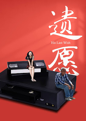
The final design outcome comprises two different designs that were created based on the same premise, my self-produced short story entitled 'His Last Wish'. Both designs share a great number of visual elements and components but with minor differences in order to serve different intentions. Figure 5 is intended to be the book cover design of the story while Figure 5.1 serves as the movie poster for the film adaptation of the story.
In both designs, two human figures can be observed sitting on a large VHS tape and a VHS player, and they are incorporated to represent the main characters of the story. As mentioned previously, the VHS tape and player are important objects for the development of the story and therefore, they are included to serve as a visual indicator of the development of the story. Both designs use red as the background colour and Chinese characters as the title to echo the theme of the story (e.g. Chinese culture and traditions). The soft light source in the background reflects the use of light in the selected Spirited Away poster (although the intentions are different; Huang's intention might be to create emphasis, while mine is to create depth to the design).
Figure 5 shows a conventional design that suits the intention of a book cover better. The medium-sized Chinese characters are placed on the top right of the composition, aligned from top to bottom and followed by the English title and author's name. Figure 5.1 takes on an experimental approach by enlarging the Chinese title and placing the English title in between the Chinese characters. This reflects Huang's overall bold use of typography and calligraphy in his poster designs. A date can also be found at the bottom right corner of the design to indicate that it is a movie premiere date and reinforce the intention of a movie poster.
Reflection
The most important piece of knowledge that I have gained from this project is certainly visual analysis. I have learned how to organise and construct my observations, analysis and interpretations of a design work in a systematic manner. Comparing the visual analysis done for this project with my previous work, I could tell it has gone much better in terms of explanations and organisation. Additionally, working on this project opened my eyes to many talented designers and artists in this world and I definitely enjoy the whole process of discovering marvellous work of designs.
One of the main challenges I have faced while completing this project was sourcing the right photos for the main characters. Call me picky but I had specific requirements for the photos (e.g. senior citizen, Asian, sitting position) and it took me almost forever to find materials that fulfills all criteria. I'd even mentally prepared myself for the worst scenario and that is to hand-draw the human characters myself. It would definitely be a nightmare. However, I was lucky enough to find images that kind of fit the requirement and of course I had to be less picky and go with them.
Overall I was quite satisfied with the outcomes of the design and I'd give myself a pat on the back for being adventurous and making the decision to enlarge the Chinese title in one of the designs. The results were beyond my expectations.
Final Reflection
What I have learned in this module
First and foremost, I have learned the design principles and several other design-related theories in this module. To be honest, back when I was contemplating Creative Media Design as my minor, I was quite intimidated by the Module Information because everything seemed so foreign and complicated to me. However, as we began to dive into the actual lectures and tutorials, the design principles came out to be easier to understand than what I had expected. Design principles are the fundamentals of design and utilising said principles into designs ensures us to create quality work. In future design projects, I would definitely keep in mind to apply the design principles. Furthermore, I have learned about the different stages of creating a work design. The process of design almost always starts from research and then moves on to idea exploration and the countless attempts on creating the design. The whole process may be tiring but every little step takes one closer to the final creation and I find it important and valuable. Additionally, this is my first time creating and managing a blog and it is certainly one of my biggest accomplishments this semester. I've always been uncomfortable with posting stuff online but the requirements of this module really pushed me out of my comfort zone. At first, I was really self-conscious and cautious with my wordings because I was afraid that people would judge me for it. However, after looking at some of my classmates' blog, I kind of loosen up and go for a more casual tone for my posts. All in all, I have learned a lot in this module and it would take forever to talk about them so allow me to end this section here.
What I enjoy the most
The tutorial sessions with Dr Jinchi and my classmates are what I anticipate and enjoy the most for the past 14 weeks. I love seeing and listening to my classmates' ideation, inspiration and their process of creating their design. It has always fascinated me how they can come up with such unique ideas and designs and it is interesting to learn from their world view and perception. Due to curiosity, I actually spent a good amount of time 'stalking' their blog, reading through their posts and admiring their final design outcome. Therefore, we can say that I contributed a good amount of views to their posts 😁. Of course, how can I forget the discussions with Dr Jinchi for the past 14 weeks? The feedback and constructive criticism from Dr Jinchi has been extremely informative and useful for me to improve my work and I appreciate her attentiveness and patience towards every student in class. Also, I consider myself lucky to be placed in a small class with less than ten people. For me it was more comfortable to speak and share my thoughts in a smaller group, otherwise I might feel intimidated and just keep quiet most of the time.
What I do not enjoy the most
Adhering to the deadlines was the only aspect I do not enjoy in this module, especially when we were doing the weekly exercises. The weekly exercises were intense and those were the days when I struggled the most. It was challenging to brainstorm for ideas and pump out designs on a weekly basis. However, I would still give myself a cookie point for completing and submitting the work on time (as far as I am concerned, I have yet to hand in my assignments late).
What I have learned about myself through this module
I have observed that I have a tendency in assigning messages and meaning to almost every design element in my design works. Reviewing all of my work in this module, almost every design comes with a deep message and back story. It seems like I tend to prioritise meaning- and purpose-driven designs. Not sure if this is a good practice or not but I would definitely want to create something that is art for art's sake if I had the opportunity, meaning I could care less of the meanings and focus on the visual appearance. Additionally, I have also learned that I prefer simplicity in a design and my style is mostly neat and clean. Perhaps I was trying to achieve the notion of 'less is more' in my designs. Another aspect I have discovered about myself is that I can be very indecisive when it comes to finalising my design outcomes. Because I was unconfident about my own decisions for most of the time, I tend to ask others for their opinion or have them decide one design for me. Certainly I am aware of the value of asking for feedback and opinions but sometimes I wish I can be confident enough about my work and make the decision myself.
What has changed and what has not changed in my learning journey
The most observable change in me is that I am more comfortable in expressing myself to a group of people. I used to be very timid and worried a lot that people would judge me for my actions and speech. However, the openness and supportiveness of the class created a conducive environment where I can be more expressive with less concern. What has not changed was the bad habit of procrastinating. To be honest, I tend to run away from my tasks and responsibilities, it is only till the very last minute that I attend to them. Although I manage to submit my work on time everytime, I should get rid of this bad habit of mine and learn how to manage time effectively.
What could be improved in this module?
So far I don't see anything that needs improvement in this module, at least none from my side. The module learning outcomes are well-informed and the instructions given in the Module Information Booklet and from the lecturer are clear and comprehensive. The learning materials provided on Times and Microsoft Teams are sufficient and useful for me to gain understanding of each topic. I appreciate the fact that students are given a lot of freedom in exploring their ideas and producing the final outcome for each assignment. Overall, I had a great learning experience and gained many insights in my journey of completing this module.


Comments
Post a Comment