Design Principle - Exercise 3 & 4
Tow Wan Tian / 0342765
Week 4 / 20.04.2021
Lecture 4 - Harmony, Unity & Proportion
This week, the lecture video was uploaded earlier than the regular schedule so we could watch it and study the topic earlier as well. The main topic was about the design principles of harmony and unity, with the additional information on proportion.
Harmony involves the application of elements that share a similar trait, may it be colours, shapes, sizes, so far and so forth, whereas unity of a work of design can be achieved when said elements are composed in a way that it is balanced and conveys a sense of oneness. Naturally, harmony and unity come hand in hand and work toward the purpose of presenting the theme or the message of a work of design.
Placing an image on the page because it looks cool is not unity. Placing an image on the page because it enhances communication of the design’s theme is unity. (Bradley, 2010)
However, having solely harmony may cause the design to appear mundane. Therefore, it is also important to give variety to a design by creating slight differences in the elements. Proportion refers to the relationship of two or more elements in a design and how they compare with one another. Utilising proportion can create visual hierarchy, balance, harmony and unity of a design.
Exercise 4
For this exercise, we are required to produce 2 designs, one for repetition and one for movement, using the mediums of poster colour or acrylic.
Visual Research
Here are some of the images I found on the internet which I believed present the principle of harmony and unity. Figure 1. is harmonious in terms of the use of similar shapes with varying sizes, as well as the use of various shades of blue. Figure 1.1 uses analogous colours of a colour wheel such as red, orange and yellow, thus it appears harmonious. However, the design also applies contrast in terms of the use of the green for the stem so that the overall design appears less monotonous.
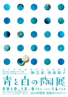
The book cover shown in Figure 1.2 seems to be harmonious as well due to its use of greyish colours and organic shapes, but it doesn't appear all boring as there is a section of white negative space. It is quite obvious that the main colour choice of the poster (Figure 1.3) is blue and white and it goes hand in hand with the purpose and the information of the poster which is about a blue and white ceramics exhibition. Hence, we can say that the design finds harmony and unity with the purpose of the poster. Not to mention the hints of variations of the patterns for each individual blue dot.
Figure 1.2 Japanese Book Cover: Black Bird · Sara Kajino, Soda Design (Left)
https://gurafiku.tumblr.com/tagged/book_cover
Figure 1.3 Japanese Exhibition Poster: Blue and White Ceramics · Nomura Design Factory (Right)
https://gurafiku.tumblr.com/post/99311775857/japanese-exhibition-poster-blue-and-white
Idea Exploration
I was slowly running out of ideas and I remembered that some course-mates talked about looking through past photographs to get inspirations. Hence, I decided to flip through the photo gallery on my phone, as well as some past artworks to get some ideas.
Since harmony and unity are correlated, I thought it is appropriate to make sketches that present both principles at the same time. I thought it would be more difficult to divide the two principles from each other. Therefore, the following sketches are applicable for either harmony or unity.
- 1. Inspired by a personal memory with flowers. I received a bouquet of tulips before back in my high school graduation ceremony. It was quite a surprise for me to see and even receive real life tulips as I have always thought that the flower is very rare in the local flower market. Therefore, the memory stood with me for a long time and I wanted to make a design that represents it. Individual tulips were arranged in a way that resembles a larger flower and below the flowers were the stem with leaves placed next to it.
- 2. A recreation of my past artwork. Clouds were applied as the leaves of the tree. Since clouds are commonly used to symbolise dreams, thus the tree with clouds can be interpreted as "the tree of dreams". I intended to draw various facial expressions on the clouds, such as happy, sad and shocked faces to signify the occurrence of sweet dreams and nightmares.
Feedback from Lecturer / Highlights
- Sketch ① - Dr. Jinchi suggested placing a large flower at the bottom row, surrounded with medium-sized flowers and followed by smaller flowers. The top row of the flowers looks a bit empty, can consider adding one more flower. A one-word text or the phrase "sweet memories" can be placed coming out from the flower (Further suggestions from the lecturer after listening to my idea of adding text to the design)
- Sketch ② - should be more careful with the portrayal of the roots if I want to convey the dreamy feel of the design. Dr. Jinchi suggested removing the ground and allowing the roots of the tree to flow freely in the air.
Final Feedback on E-blog and Exercise 4
Dr. Jinchi : The soothing pastel colours and expressions of the "cloud-leaves" reflect Harmony. The grouped tulips in a bouquet reflects Unity. The handwritten text above the bouquet lessens the monotony in the composition.
Final Design Outcome
Harmony
To further enhance the dreamy and slightly whimsical feel of the design, soft pastel colours such as blue, pink and yellow were used to paint in the clouds (which later reminded me of a tree full of cotton candies). I mixed too much purple paint for the design of unity and there were many left. Decided not to waste any spare paint, I remixed the purple paint and used it to colour the tree trunk and its branches. Purple tree trunk was definitely unusual and I thought it fit the theme and colour scheme of the design quite well. Various happy facial expressions were painted on the clouds to show them as sweet happy dreams; I scraped the previous idea of painting sad expressions because the existing colour scheme felt too "positive" to be sad and I didn't want to tone down some of the colours for the sole purpose of painting sad expressions.
Unity
I know that tulips come in different colours but I did not want to go for common colours such as yellow and red. In fact I choose to use purple, or to be more specific, the kind of purple that resembles lilac. It used to be my favourite colour, but I grew out of it and now the colour holds some sort of nostalgia for me, thus I wanted to apply this colour into the design to further enhance the concept of memories. Each individual tulip varies in sizes and were painted with different shades of purple. The piece of text "Sweet memories" was written in calligraphy and arranged as if it was the sweet scent coming out from the tulips.
Reflection
This week was a busy week for me. Weekly tasks from other modules were more urgent and I had no other choice but to sacrifice some of the allocated time for sketching designs. That's why I had only come up with only one design for each principle. Furthermore, I think I'm now experiencing the so-called "art block" (well, on second thought, maybe it's not that serious). However, it is true that I'm facing difficulties in generating ideas for the designs, especially during the days when there is so much to do but so little time. This struggle that I'm experiencing now is also probably due to the fact that I'm stuck at home for too long and I'm gradually losing my senses with the outside world. In this current situation, I know that staying at home is for the greater good but sometimes I do have the urge to venture outside to get inspirations, and yet part of me is holding that sudden urge as I don't want to expose myself and anyone to any risks. However, looking on the bright side, I'm fortunate even to have stable access to the internet and so far it has been a staple source of ideas and inspiration, and from time to time I might even draw inspiration from my personal experiences. I'm not sure what I could do to overcome this struggle but I don't want to overthink and get too stressed with it. I guess it will go away eventually.
Week 3 / 13.04.2021
Lecture 3 - Repetition, Movement, Hierarchy & Alignment
Prior to the lecture on this week's topic, Dr. Jinchi gave feedback on each students' e-blog and their work for Exercise 2 during the virtual meeting of the week.
After the meeting, we were instructed to watch the recorded lecture video of the week to learn more about the design principles of repetition and movement, as well as some compositional guidelines such as visual hierarchy and alignment. Naturally, we would start working on Exercise 3 after watching the video and reading supplementary material.
Below shows a summary of my understanding of the content shown in the lecture video:
- Repetition - the purpose of applying repetition is to make the work of design appear more active. It creates pattern and rhythm; in some cases, adding variety to the rhythm can increase the visual interest of the design. When it comes to this principle, its natural for us to only think of the repeated use of pattern, but repetition can also be done through repeating certain arrangements.
- Movement - it is the way a design leads the eyes in, around and through a composition; also known as the path of the eyes follow. Movement can be achieved through the arrangement of various design elements. As the designer, we should always take note of the purpose of the design, the intended messages and information while arranging the elements. Different purposes call for different use of movement.
- Hierarchy - it can be referred to as the choreography of the content of the composition. In other words, it allows the viewers to see the most important information or elements first and then gradually leads them to the secondary content. The primary information are usually larger in size and are given more visual weight.
- Alignment - it is the way of placing and lining up elements along rows/columns. The main function of it is to create unity, cohesion and stability. Additionally, it also contributes to the overall neatness of the work of design.
Exercise 3
For this exercise, we are required to produce 2 designs, one for repetition and one for movement, using the mediums of watercolour or pastels.
Visual Research
Repetition
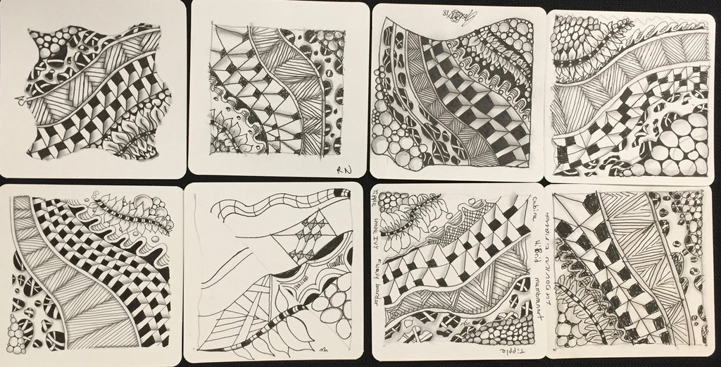
In fact, I happened to own an instructional book that teaches on the ideation of drawing patterns and demonstrates the different ways of drawing them. The book is called "重复画的正能量" (roughly translated as “The Energy of Repeated Drawings”) written in Mandarin by a Taiwanese author named "阿彬叔叔" (My apologies as I don't know how to refer to him in English). This book was a great source for inspiration!
I continued to look for more inspirations on the internet but there weren't many designs that sparked ideas for me, until I came across this image:
The illustration was presumably about corals and I love the use of patterns on the corals. Therefore, I was interested in designing something sea/ocean-themed and specifically I wanted to include corals or coral reefs in the design.
Movement
I came across these illustrations on Pinterest and thought that they represent the principle of movement very well. Figure 1.3 uses waves and the curved paddles to imply the forward movement of the boat, whereas in Figure 1.4, bold circular brush strokes of the motions of the arms as well as the overall poses of the skaters also indicated the fast and intense movement of the design. I believed these were some aspects that I could take into consideration when sketching the designs.


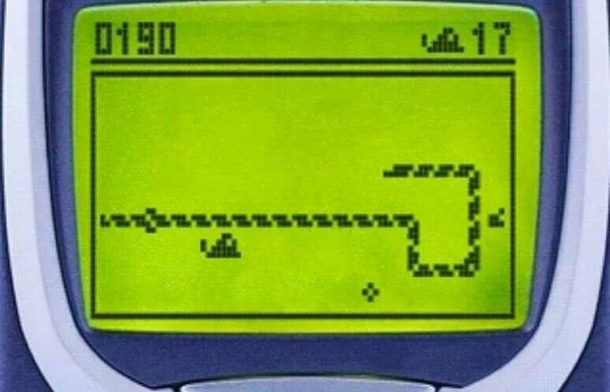
Additionally, movement reminded me of the classic video/mobile game "Snake" as the snake should always be in motion in the game.
Idea Exploration
Repetition
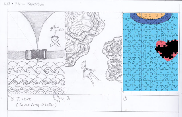
- 1. To Hope - Inspired by the 7th anniversary of the Sewol Ferry Disaster that happened not long ago on 16/04/2021. On that day, I read an article that talks about the tragedy in detail and felt quite emotional afterwards. A couple days later, as I was sketching a design with the sea theme, I got the idea to make a design for the tragedy as to pay respect to the victims and survivors. The life jacket and patterns of waves were used to symbolise the incident of the ferry capsized and sinking into the sea. The yellow ribbon (the symbol of the incident that represents the hope for missing victims to return) was placed at the upper right section of the life jacket which was around the area of the heart, signifying that the disaster will always be in the hearts of many people.
- 2. I continued to explore more ideas with the theme of seas and oceans. Inspired by the coral-like elements in the illustration (Figure 1.2), I went on to sketch out some coral reefs with patterns inspired by Zentangle. A girl was drawn in a way to indicate that she was floating on the surface of the sea, and beneath her are large areas of coral reefs. The design also represents one of my experiences where I got the opportunity to go snorkelling in Pulau Redang and Pulau Lang Tengah. This was many years ago and I couldn't recall much of the details of the experience, but I could clearly remember that I liked the feeling of floating on the surface of the sea.
- 3. An alternative of the first sketch inspired by a sketch done by one of our course-mates, Ee Chyn (see Figure 2.2.2 in her e-blog). I like her use of jigsaw puzzles in the design and I thought that the repeated shapes of jigsaw puzzles were quite suitable for the topic of repetition. The design represents an incomplete jigsaw puzzle with missing pieces, and the missing pieces are supposed to make up parts of the heart-shaped figure. This design signifies the feeling of one's emptiness and hollowness in the heart.
Movement
- 1. Inspired by the mobile game Snake, I tried to spell out the individual letters of the word "Snake" using individual snakes. I like the idea but I felt that it was too simple and common, and the principle of movement was less prominent. Additionally, the snakes were facing in different directions and it felt messy and out of order.
- 2. I decided to explore the idea of the Snake with a different approach. I focused on having only one snake and a small human figure riding the snake as the main subjects of the design. The torso of the snake is elongated until it was out of the frame to indicate its almost never-ending length. The fruit in the bottom left corner of the composition would be the first element to catch the eyes, and then leads the eyes to the snake. Clouds were included in the background to indicate that the game is set in the sky, instead of the ground.
Feedback from Lecturer / Highlights
Repetition (Figure 2.)
- Sketch ① - Dr. Jinchi pointed out that the yellow ribbon was somewhat breaking the symmetrical balance of the composition. She suggested that the yellow ribbon could be placed somewhere at the middle of the composition. Later, she commented the repeated use of stylised waves shows the movement of the design and there's a good mixture of static elements (e.g the safety gears of the life jacket) and moving objects (e.g the waves). She suggested that if I want to continue work this design, I could try colouring the waves in different shades of blues.
- Sketch ② - Repetition was present in terms of shapes and lines; suggested that there could be more smaller shapes of corals placed at the top and bottom corners of the canvas to show more repetition and create balance. There's a good understanding of open composition. In addition, she commented that the composition was less rigid and had more flexibility.
- Sketch ③ - Sketch ① and Sketch ③ has stronger repetition elements in comparison with Sketch ②Good to make the attempt to redesign the first design.
Movement (Figure 2.1)
- Sketch ① - The idea was present, suggested that I could attempt to redesign it with the finishing of Sketch ② to give a effect.
- Sketch ② - Having the sky as the background can suggest more movement. The hair of the little human figure can be drawn flying back of their head in order to enhance the movement of the design. Dr. Jinchi further suggested looking up references of Chinese paintings of dragons in order to get ideas and improve the movement and position of the snake.
Final Feedback on E-blog and Exercise 3
Dr. Jinchi : The composition for Repetition is interesting as it tells a story in quite a surreal outlook. The complementary colours used hint at the idea of the accident. For Movement, the proportion of the snake's body as well as the hair movement of the girl further enhances the principle in the overall design.
Final Design Outcome
I have chosen Sketch ① (Figure 2.) as my final design for the principle of repetition, whereas Sketch ② (Figure 2.1) was chosen as the final design for the principle of movement. Watercolour was used to produced both final designs.


Comments
Post a Comment